Undertow Collective
Process
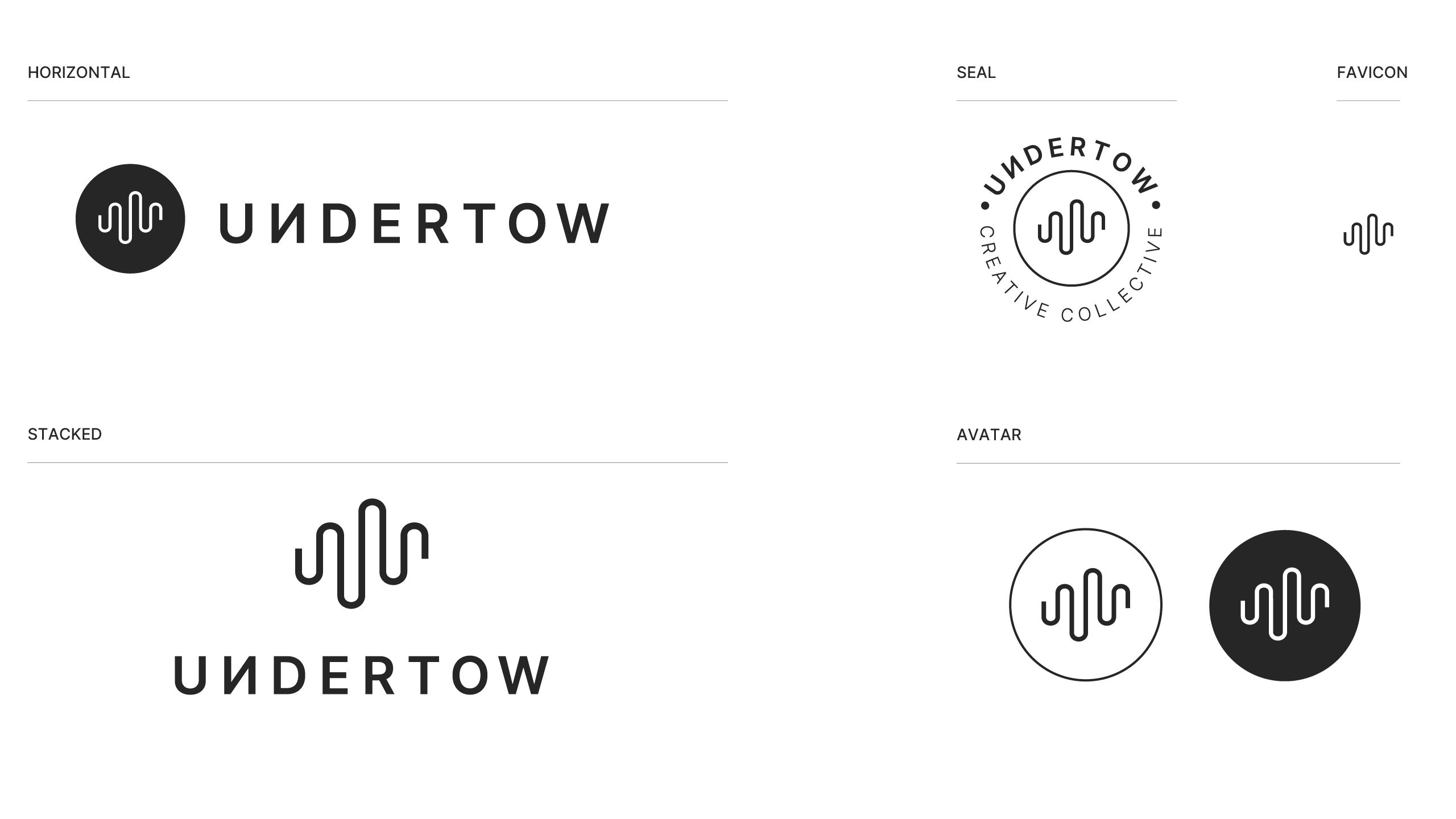
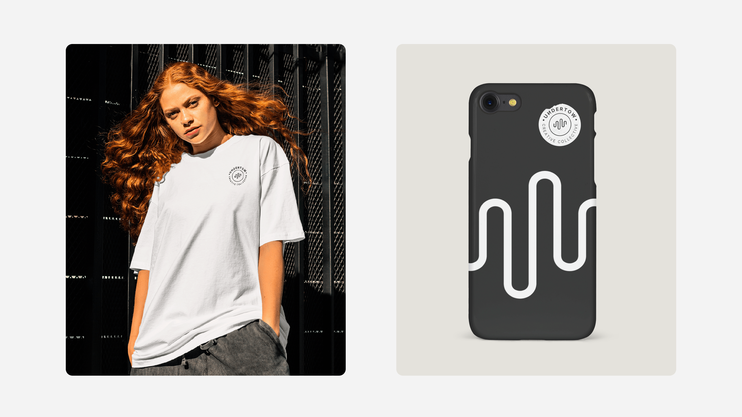
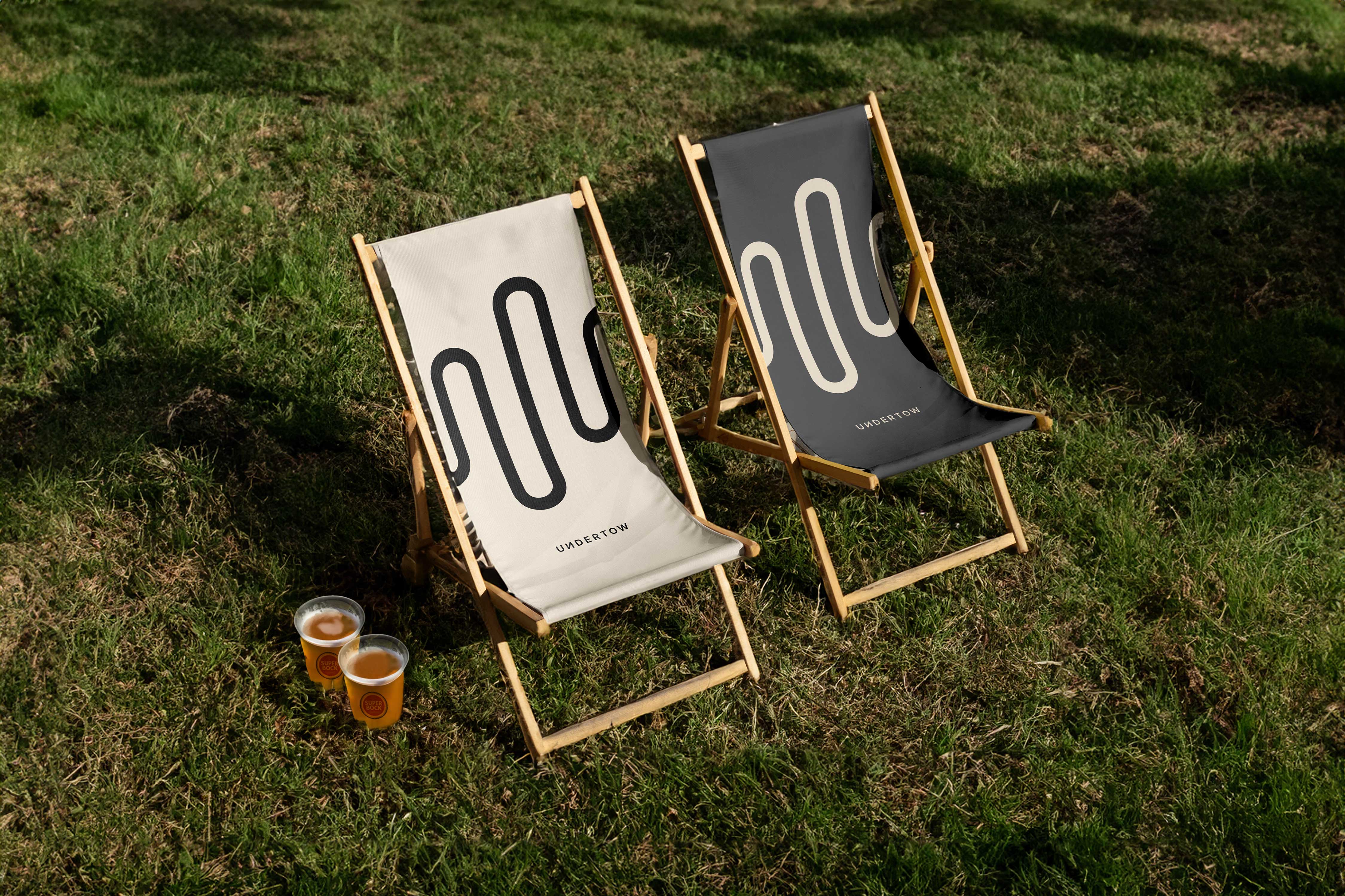
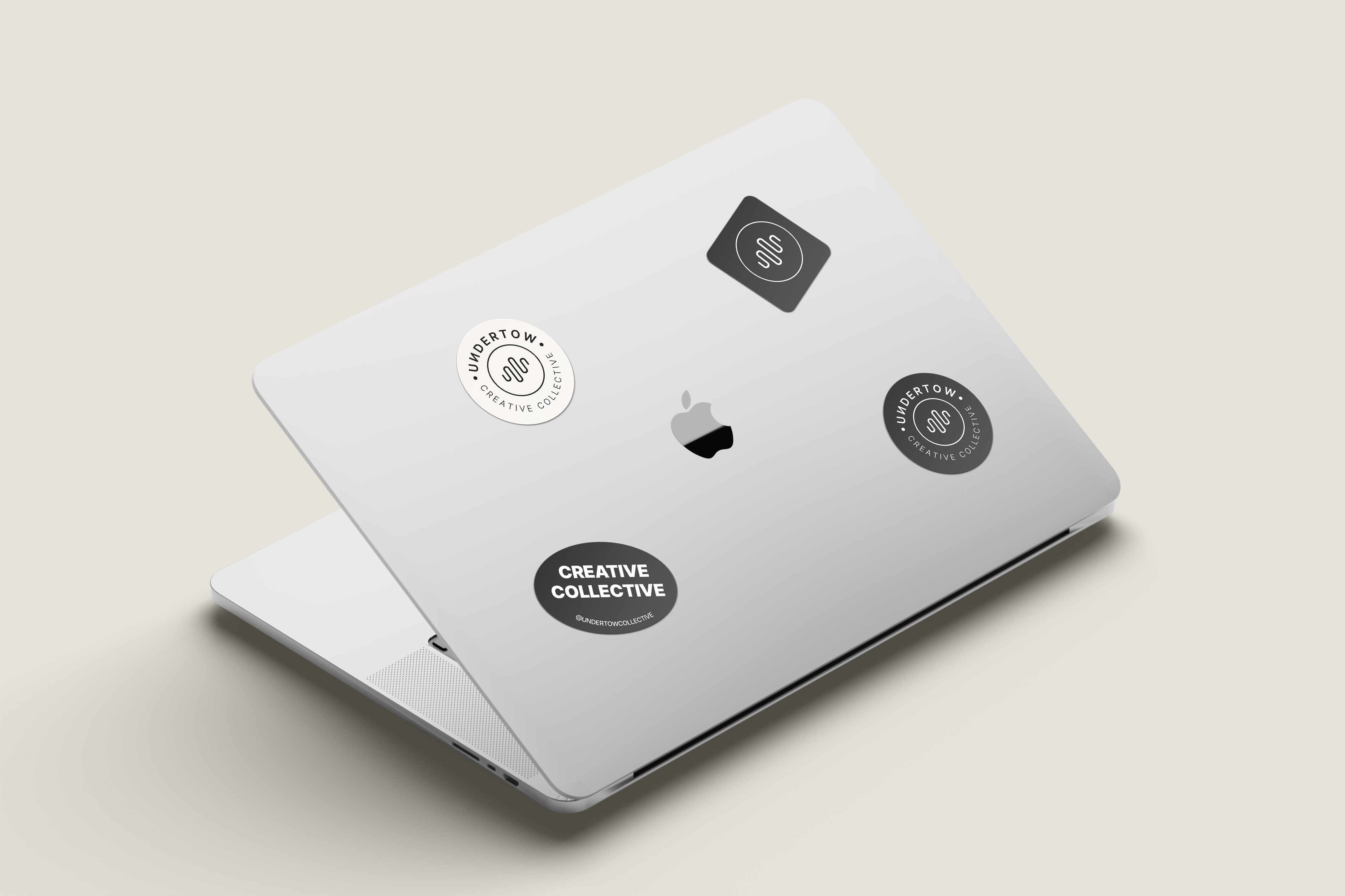
Logotype
The logo is inspired by the force of an undertow, connecting to the hidden currents between music and culture. The symbol represents the motion of sound waves and reflects the collective’s goal of highlighting the voices and movements that are often overlooked in art and music.
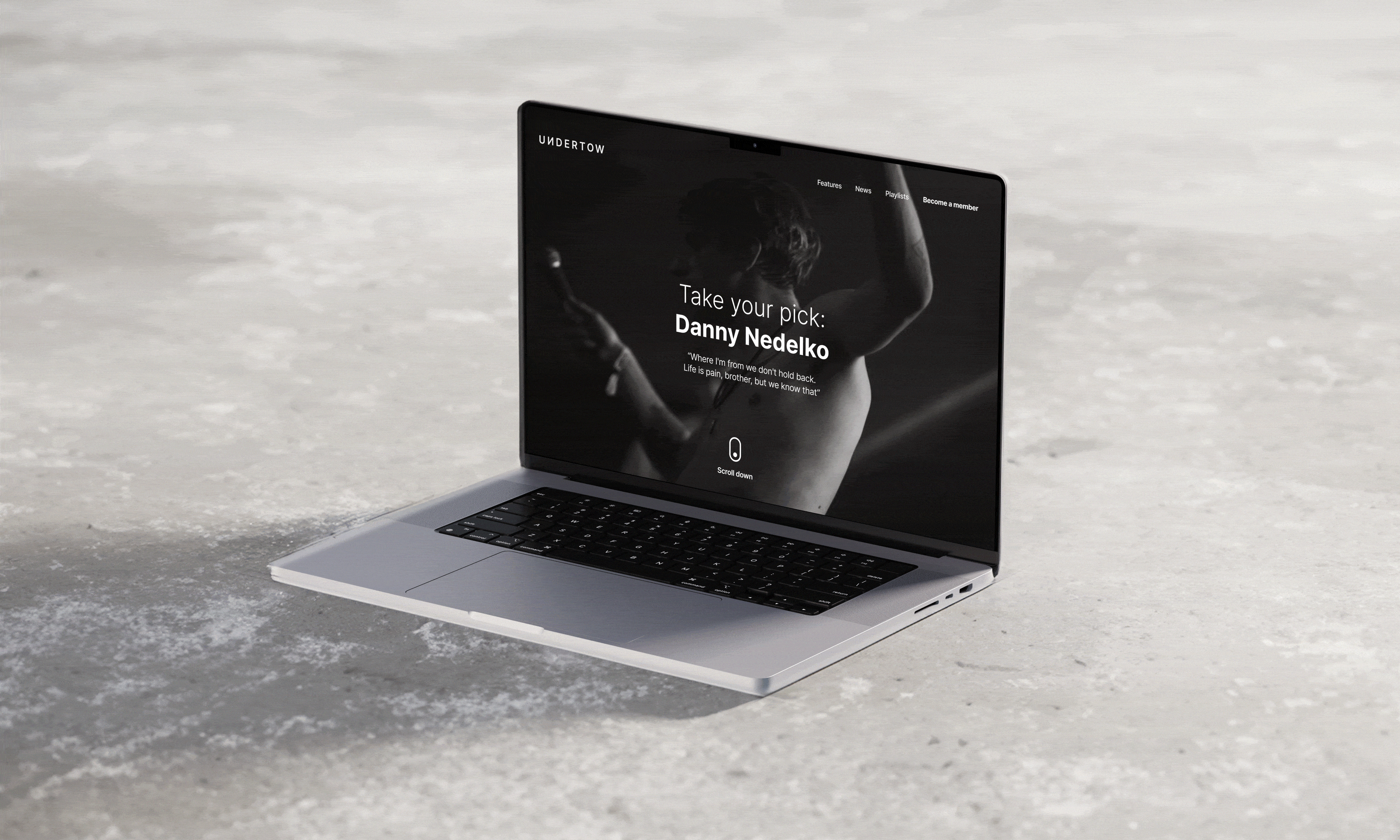
Font
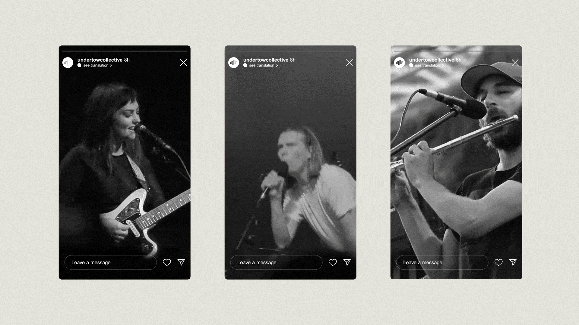
The sans-serif 'Inter' font by Google supports the collective’s modern and minimalist style. It's versatile, working well in the logo as well as on websites and social media. The clean lines match the wave symbol, balancing structure with movement.
Colour Palette
The monochrome, grayscale palette lets the art and music stand out. The neutral colours ensure the visuals of the content are highlighted and stay in focus across different platforms.